Responsible design, an inclusive society.
Responsible design, an inclusive society.
Responsible design, an inclusive society.
Design that connects people, removes barriers, and drives positive change.
Design that connects people, removes barriers, and drives positive change.
Design that connects people, removes barriers, and drives positive change.
How we make design accessible?
How we make design accessible?
How we make design accessible?
Simple. We break the rules to make room for every single human.
Simple. We break the rules to make room for every single human.
Simple. We break the rules to make room for every single human.
Accessible Technology in Design
Accessible Technology in Design
Accessible Technology in Design
We incorporate elements like braille, large fonts, and high contrast to ensure that everyone, regardless of their abilities, can fully engage with our products and services.
We incorporate elements like braille, large fonts, and high contrast to ensure that everyone, regardless of their abilities, can fully engage with our products and services.
We incorporate elements like braille, large fonts, and high contrast to ensure that everyone, regardless of their abilities, can fully engage with our products and services.
Designs that tell inclusive stories
Designs that tell inclusive stories
Designs that tell inclusive stories
We create designs that celebrate diversity and foster meaningful connections, ensuring that every person feels valued, heard, and represented in a way that resonates with them.
We create designs that celebrate diversity and foster meaningful connections, ensuring that every person feels valued, heard, and represented in a way that resonates with them.
Humane-centered design
Humane-centered design
Humane-centered design
We place the user at the heart of every design decision, making sure accessibility features enhance the overall experience without sacrificing quality.
We place the user at the heart of every design decision, making sure accessibility features enhance the overall experience without sacrificing quality.
Here’s How We Bring These Values to Life
Here’s How We Bring These Values to Life
Here’s How We Bring These Values to Life
Beyond the image: Amplifying accessibility with Alt Text
Beyond the Image:
Amplifying accessibility with Alt Text
Beyond the image: Amplifying accessibility with Alt Text
Alt text, or alternative text, serves as a textual description of an image, providing crucial context and meaning for users who cannot perceive visual content. This includes individuals with visual impairments who rely on screen readers to navigate and interact with digital environments. By describing the visual content of an image in a clear, concise, and relevant manner, alt text ensures that essential information is accessible to everyone.
Beyond fulfilling accessibility standards, this practice embodies our dedication to inclusivity, promoting equal access to information and enhancing the overall user experience. It demonstrates our belief that design should break down barriers, enabling all individuals, regardless of their abilities or circumstances, to engage with digital spaces meaningfully. Properly implemented alt text is a reflection of our values, reinforcing our commitment to creating thoughtful, human-centered designs that resonate with and empower diverse audiences.
One of the key practices in this commitment is the proper use of alt text in all the images we use in our digital projects. The purpose of alt text is to clearly and concisely describe the visual content of an image, ensuring that people who cannot see the image, such as individuals with visual impairments using screen readers, can understand the information it conveys. This use not only facilitates accessibility, but also reinforces our commitment to designing inclusive and meaningful experiences for all people, regardless of their abilities.
Alt text, or alternative text, serves as a textual description of an image, providing crucial context and meaning for users who cannot perceive visual content. This includes individuals with visual impairments who rely on screen readers to navigate and interact with digital environments. By describing the visual content of an image in a clear, concise, and relevant manner, alt text ensures that essential information is accessible to everyone.
Beyond fulfilling accessibility standards, this practice embodies our dedication to inclusivity, promoting equal access to information and enhancing the overall user experience. It demonstrates our belief that design should break down barriers, enabling all individuals, regardless of their abilities or circumstances, to engage with digital spaces meaningfully. Properly implemented alt text is a reflection of our values, reinforcing our commitment to creating thoughtful, human-centered designs that resonate with and empower diverse audiences.



A young person with long black hair and a serious expression stands outdoors. They wear a simple, light-colored shirt and are surrounded by lush greenery. The background features trees and foliage, and the individual appears to be sweating slightly, suggesting a warm environment. The focus is on their face, which conveys a sense of intensity.
A young person with long black hair and a serious expression stands outdoors. They wear a simple, light-colored shirt and are surrounded by lush greenery. The background features trees and foliage, and the individual appears to be sweating slightly, suggesting a warm environment. The focus is on their face, which conveys a sense of intensity.
A young person with long black hair and a serious expression stands outdoors. They wear a simple, light-colored shirt and are surrounded by lush greenery. The background features trees and foliage, and the individual appears to be sweating slightly, suggesting a warm environment. The focus is on their face, which conveys a sense of intensity.
Color you can trust: Ensuring proper contrast for accessibility
Color you can trust:
Ensuring proper contrast for accessibility
Color you can trust: Ensuring proper contrast for accessibility



We design with accessibility in mind by ensuring that all color choices meet proper contrast standards. This allows people with visual impairments, including those with low vision or color blindness, to easily access and interpret the information in our designs. Our goal is to create visuals that are clear, legible, and inclusive for everyone—no matter their abilities. By adhering to contrast guidelines, we ensure that design is not just beautiful but functional and equitable for all.
We design with accessibility in mind by ensuring that all color choices meet proper contrast standards. This allows people with visual impairments, including those with low vision or color blindness, to easily access and interpret the information in our designs. Our goal is to create visuals that are clear, legible, and inclusive for everyone—no matter their abilities. By adhering to contrast guidelines, we ensure that design is not just beautiful but functional and equitable for all.
We design with accessibility in mind by ensuring that all color choices meet proper contrast standards. This allows people with visual impairments, including those with low vision or color blindness, to easily access and interpret the information in our designs. Our goal is to create visuals that are clear, legible, and inclusive for everyone—no matter their abilities. By adhering to contrast guidelines, we ensure that design is not just beautiful but functional and equitable for all.
Type that speaks to all: The power of readable typography
Type that speaks:
The power of readable typography
Type that speaks to all: The power of readable typography
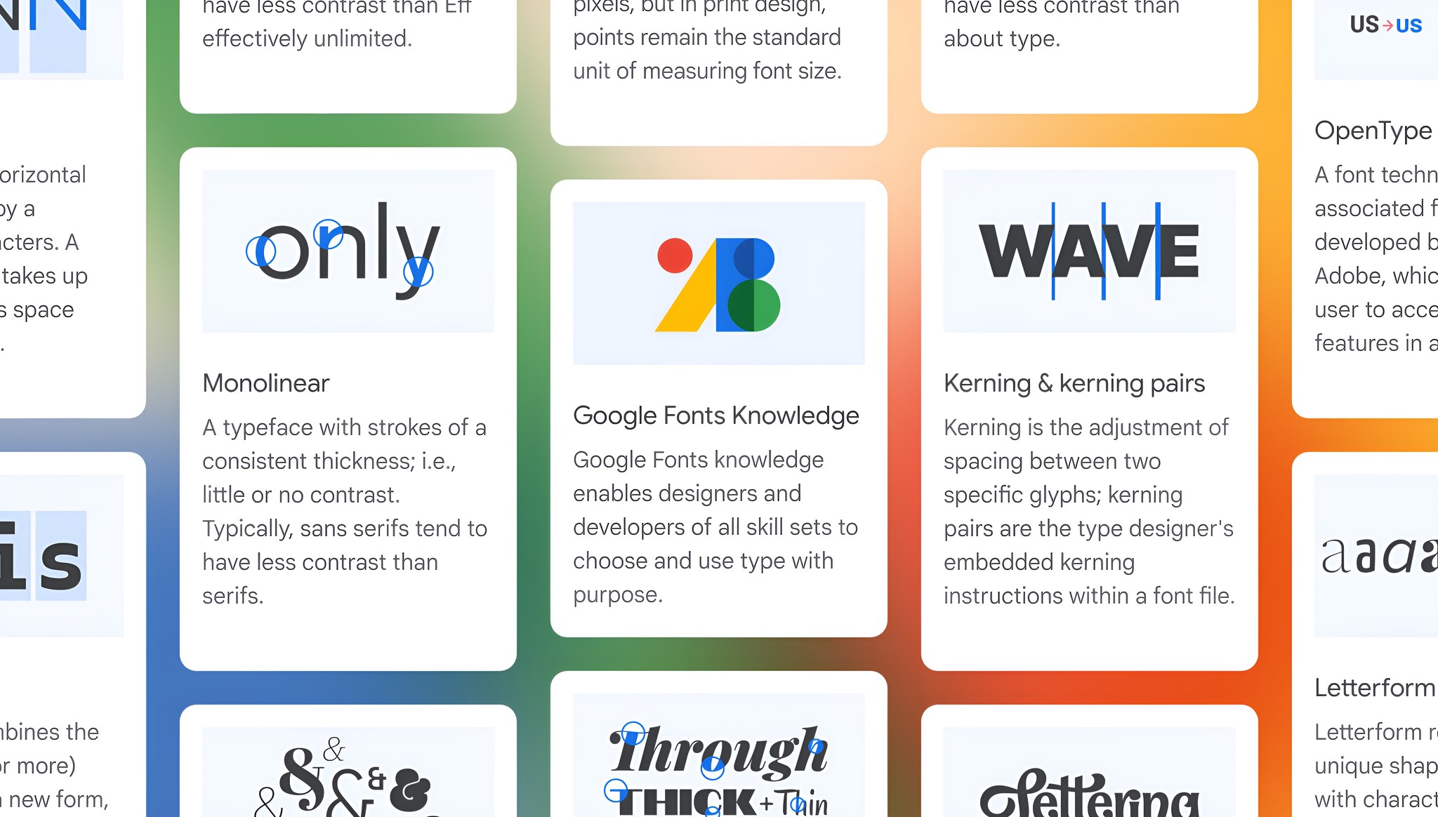


Typography is more than just style; it’s about clarity, accessibility, and inclusion. Using readable, accessible fonts ensures that all individuals, regardless of visual ability, can engage with your content effortlessly. Thoughtful typography empowers communication by prioritizing legibility and ease of reading, making designs welcoming and accessible for everyone. We prioritize accessibility and clarity in every design choice, which is why we use readable, open-source, multilingual, and versatile typefaces. These fonts support all users by ensuring legibility, consistency across platforms, and inclusivity for diverse audiences. Designed for all environments and all abilities, they are a core part of our commitment to accessible design.
Typography is more than just style; it’s about clarity, accessibility, and inclusion. Using readable, accessible fonts ensures that all individuals, regardless of visual ability, can engage with your content effortlessly. Thoughtful typography empowers communication by prioritizing legibility and ease of reading, making designs welcoming and accessible for everyone. We prioritize accessibility and clarity in every design choice, which is why we use readable, open-source, multilingual, and versatile typefaces. These fonts support all users by ensuring legibility, consistency across platforms, and inclusivity for diverse audiences. Designed for all environments and all abilities, they are a core part of our commitment to accessible design.
Typography is more than just style; it’s about clarity, accessibility, and inclusion. Using readable, accessible fonts ensures that all individuals, regardless of visual ability, can engage with your content effortlessly. Thoughtful typography empowers communication by prioritizing legibility and ease of reading, making designs welcoming and accessible for everyone. We prioritize accessibility and clarity in every design choice, which is why we use readable, open-source, multilingual, and versatile typefaces. These fonts support all users by ensuring legibility, consistency across platforms, and inclusivity for diverse audiences. Designed for all environments and all abilities, they are a core part of our commitment to accessible design.