Fuji Water
Fuji Water
Fuji Water
Clear Waters, Clear Intentions
Clear Waters, Clear Intentions
Clear Waters, Clear Intentions
Redefining the beverage experience with purity,
sustainability, and inclusive design for a better tomorrow
Redefining the beverage experience with purity, sustainability, and inclusive design for a better tomorrow
富士山の湧き水から生まれたこの水は、革新的な再生紙ボトルに収められています。水に強く、中身を守り、どんな強い日差しにも耐えるよう設計されています。
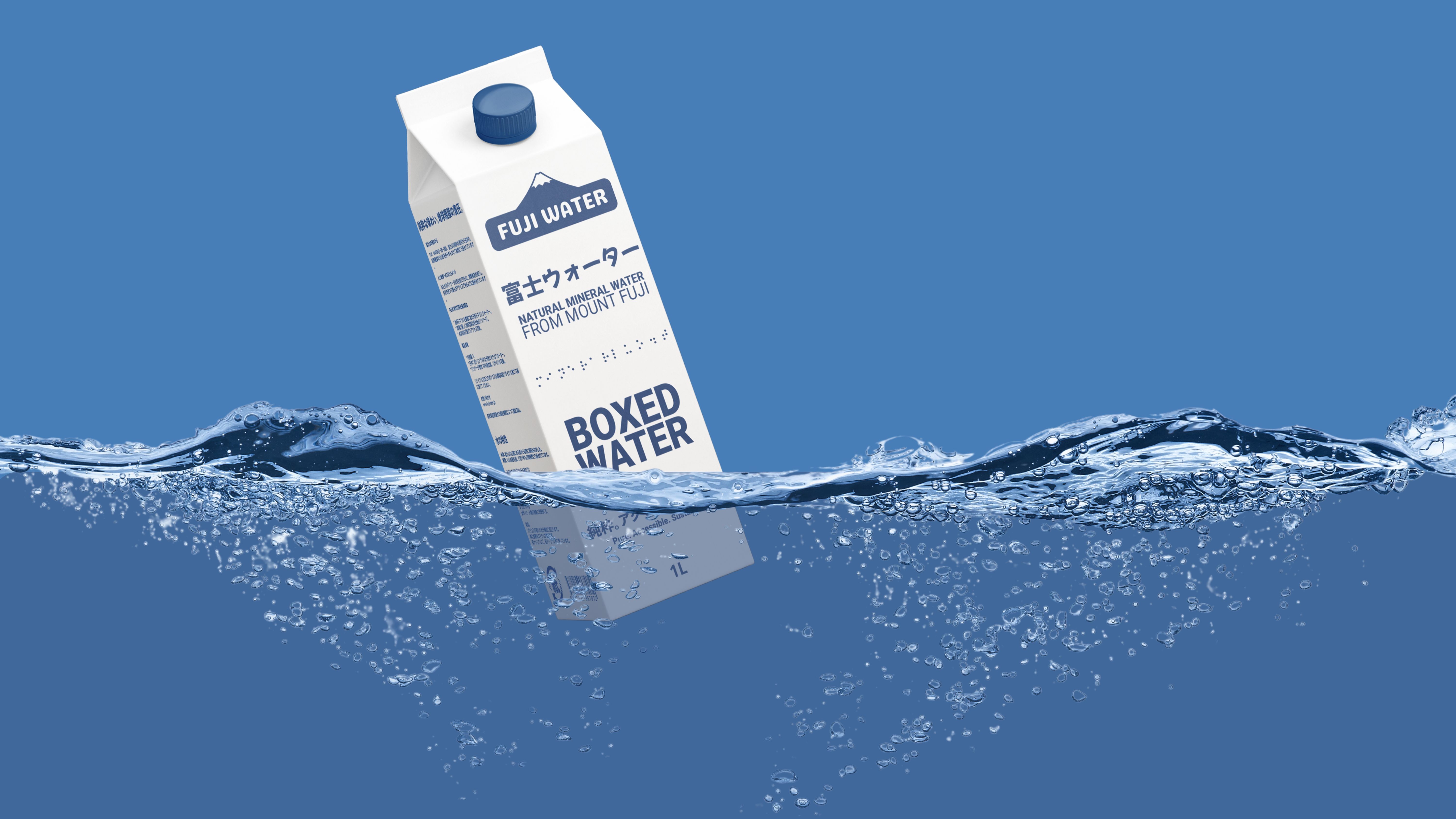
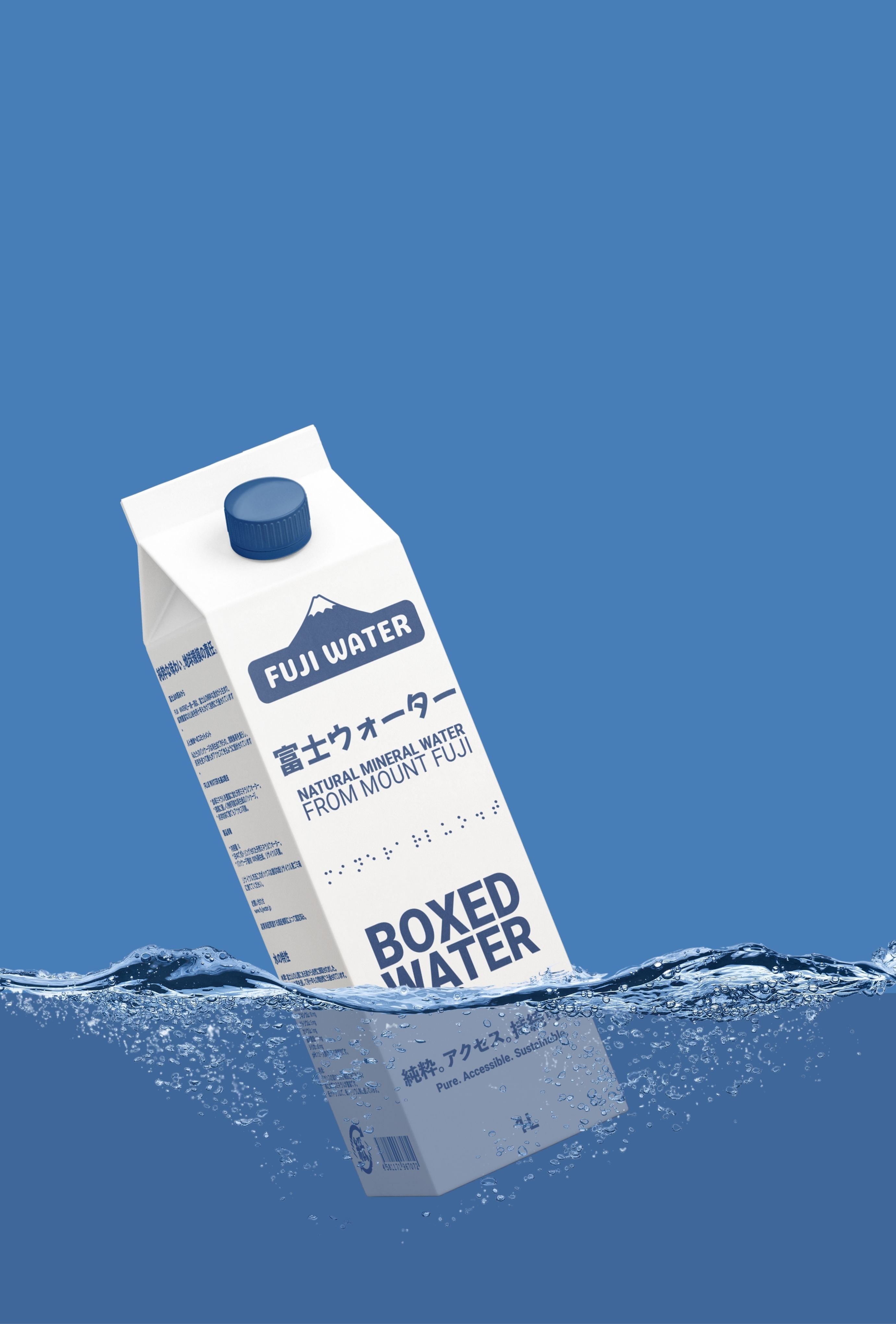
From the springs of Mount Fuji, housed in an innovative recycled paper bottle. Engineered to defy water, shield its contents, and endure the harshest sunlight without compromise.
富士山の湧き水から生まれたこの水は、革新的な再生紙ボトルに収められています。水に強く、中身を守り、どんな強い日差しにも耐えるよう設計されています。
From the springs of Mount Fuji, housed in an innovative recycled paper bottle. Engineered to defy water, shield its contents, and endure the harshest sunlight without compromise.

富士山の湧き水から生まれたこの水は、革新的な再生紙ボトルに収められています。水に強く、中身を守り、どんな強い日差しにも耐えるよう設計されています。
From the springs of Mount Fuji, housed in an innovative recycled paper bottle. Engineered to defy water, shield its contents, and endure the harshest sunlight without compromise.
富士山の湧き水から生まれたこの水は、革新的な再生紙ボトルに収められています。水に強く、中身を守り、どんな強い日差しにも耐えるよう設計されています。
From the springs of Mount Fuji, housed in an innovative recycled paper bottle. Engineered to defy water, shield its contents, and endure the harshest sunlight without compromise.
Branding & Packaging
Branding & Packaging
Branding & Packaging
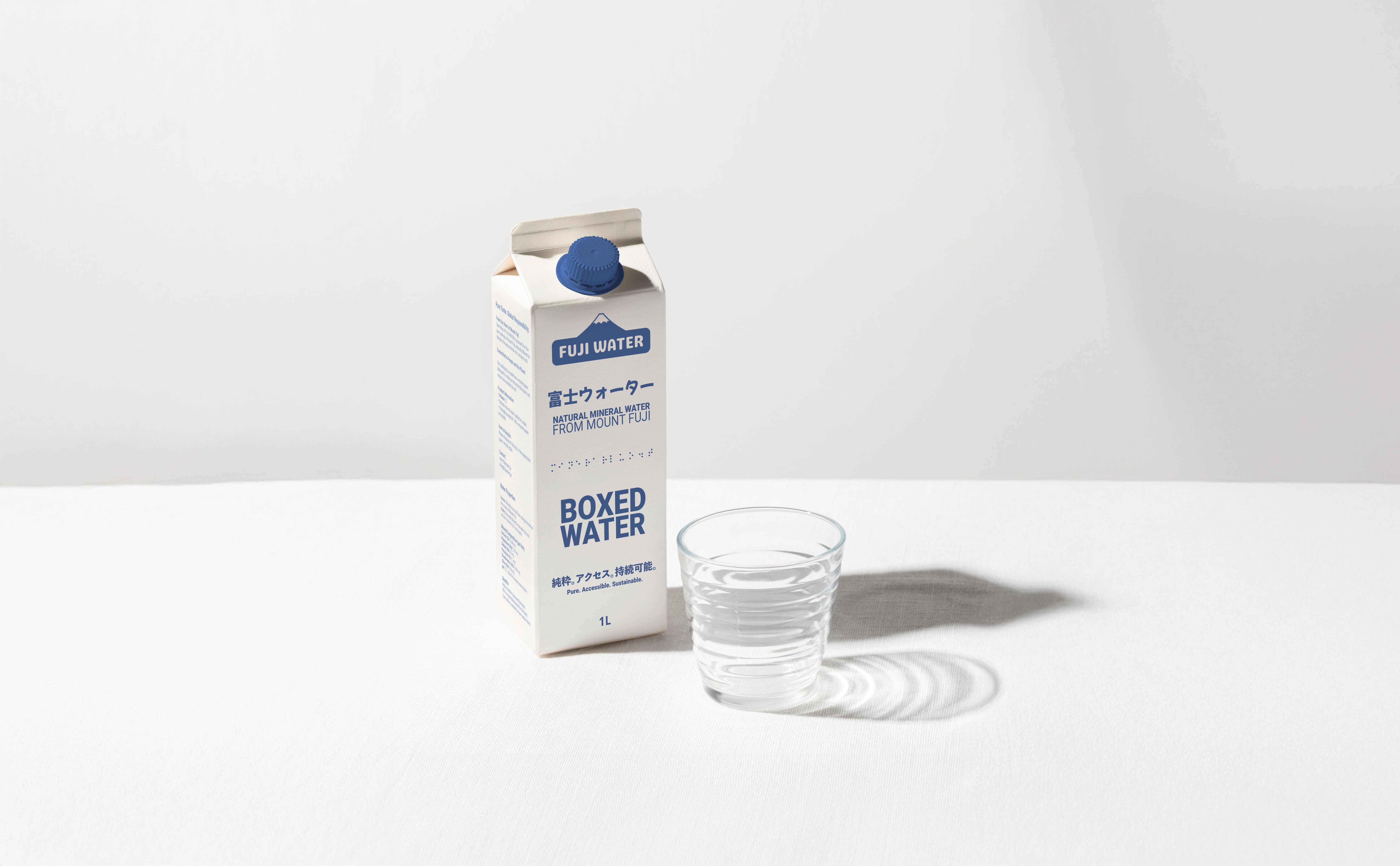
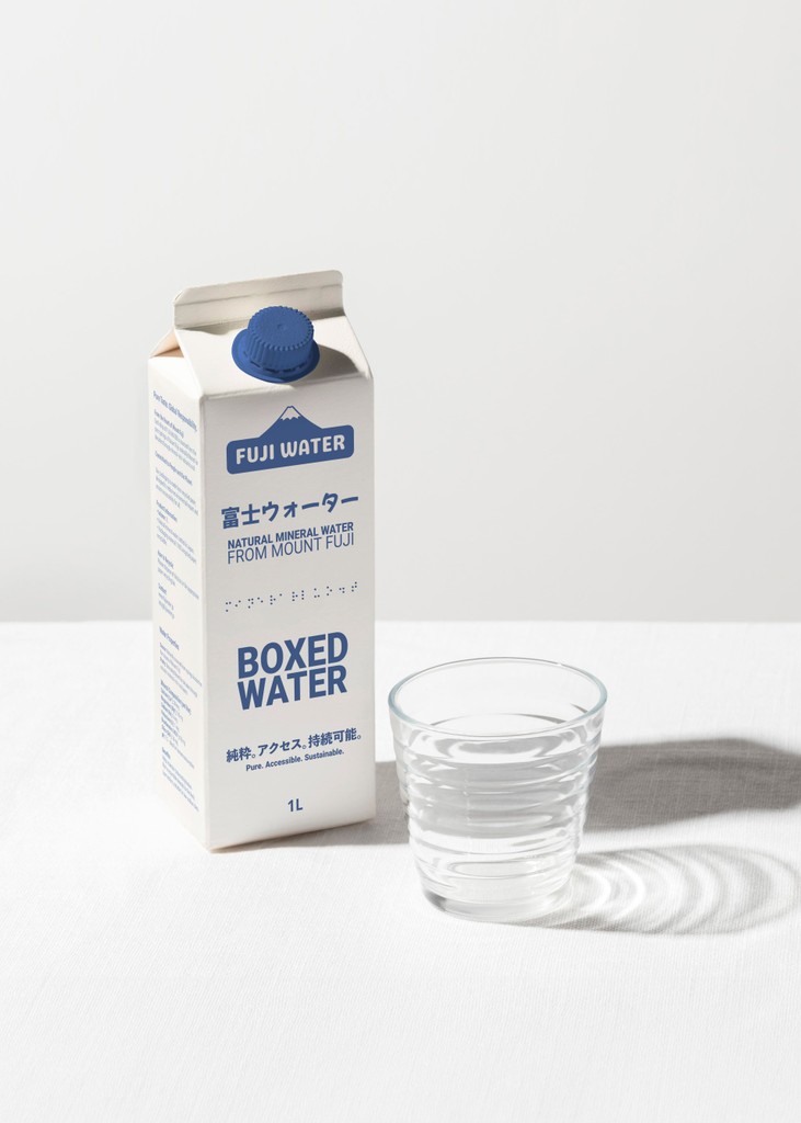
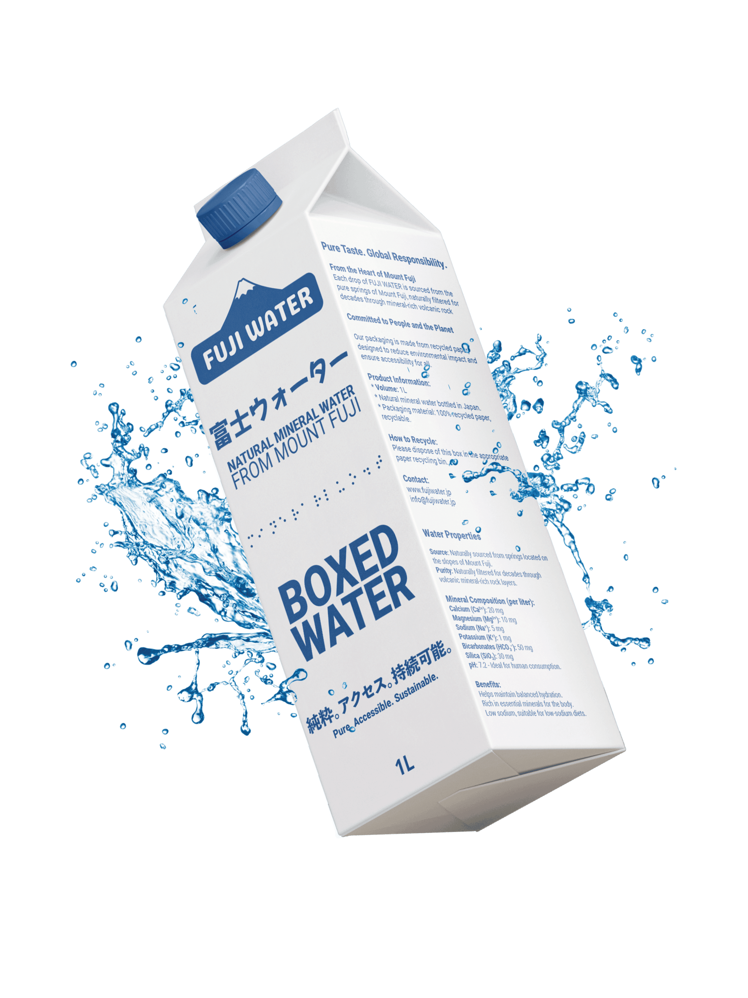
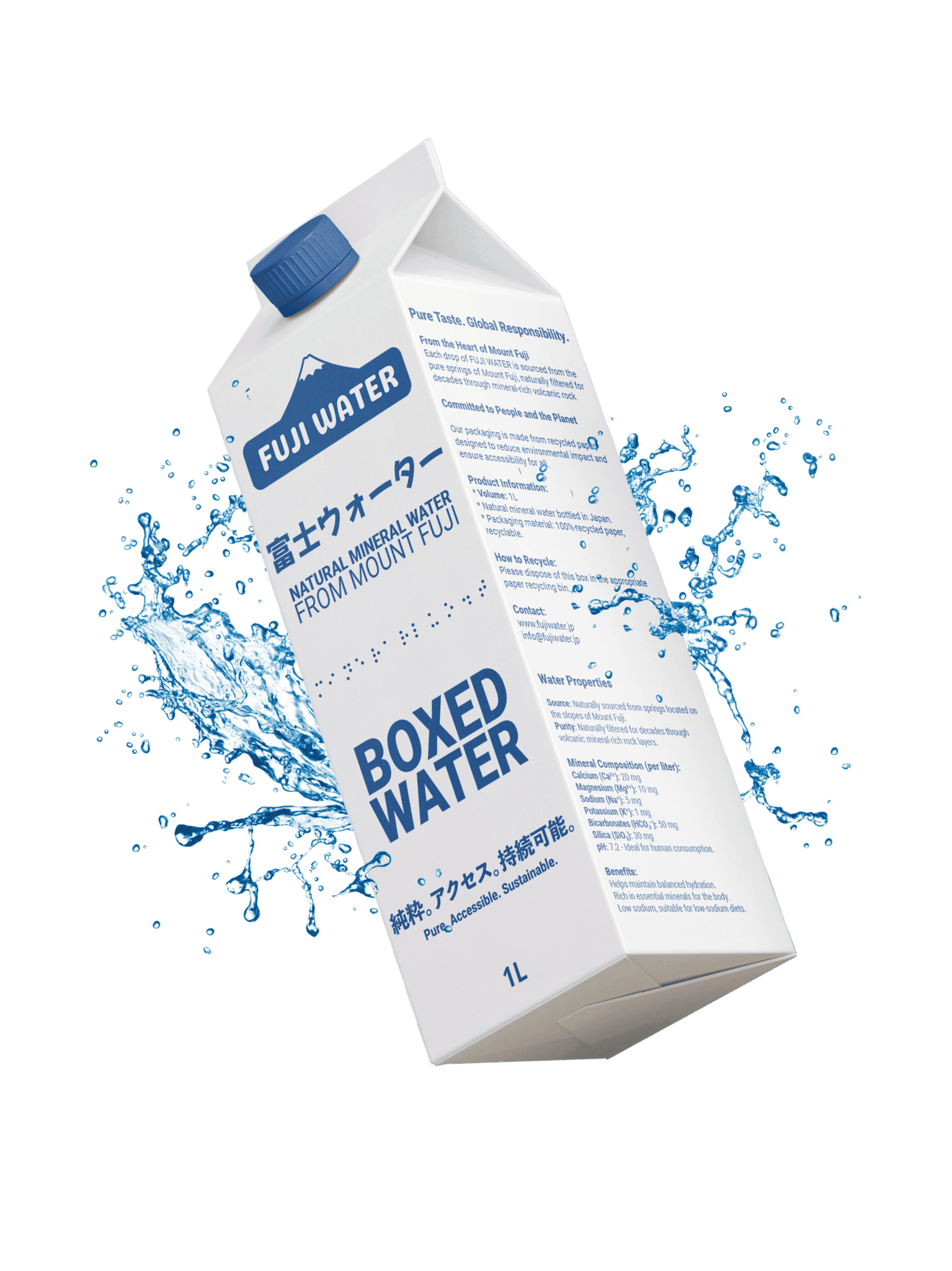
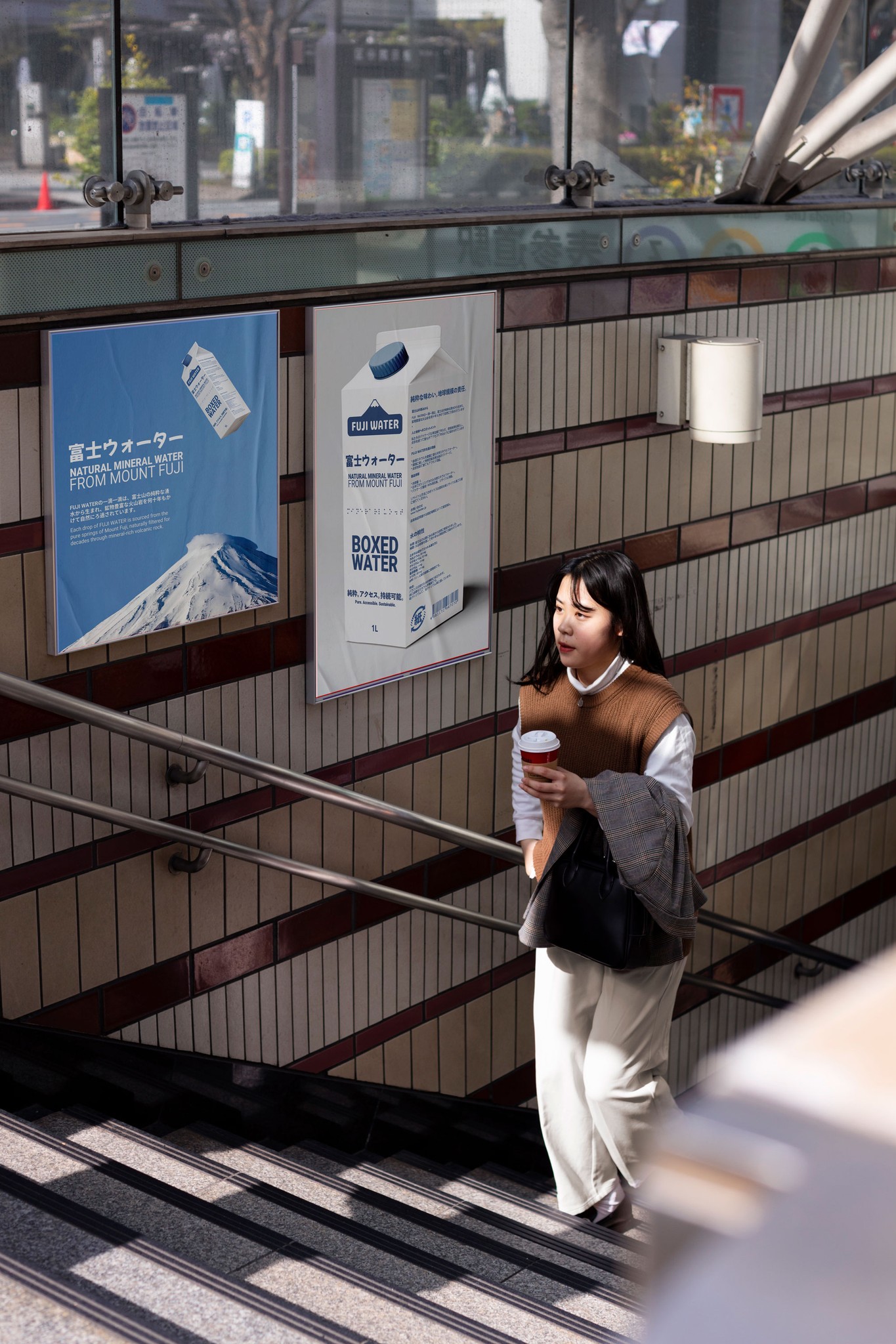
Fuji Water is a beverage brand inspired by the purity and tranquility of Japanese springs, aiming to deliver a refreshing and sustainable experience. We crafted a complete visual identity and inclusive packaging design, integrating elements like braille for accessibility. Our design brought this vision to life, focusing on a clean and minimal aesthetic that reflects the brand’s core values of purity, innovation, and respect for nature. The result is a presence as refreshing and transparent as the product itself.
Fuji Water is a beverage brand inspired by the purity and tranquility of Japanese springs, aiming to deliver a refreshing and sustainable experience. We crafted a complete visual identity and inclusive packaging design, integrating elements like braille for accessibility. Our design brought this vision to life, focusing on a clean and minimal aesthetic that reflects the brand’s core values of purity, innovation, and respect for nature. The result is a presence as refreshing and transparent as the product itself.
CLIENT
CLIENT
Fuji Water
Fuji Water
YEAR
YEAR
2024
2024
CATEGORY
CATEGORY
Branding / Packaging
Branding / Packaging

Redefining Purity Through Inclusive Design
Redefining Purity Through Inclusive Design
Redefining Purity Through Inclusive Design
Project Overview
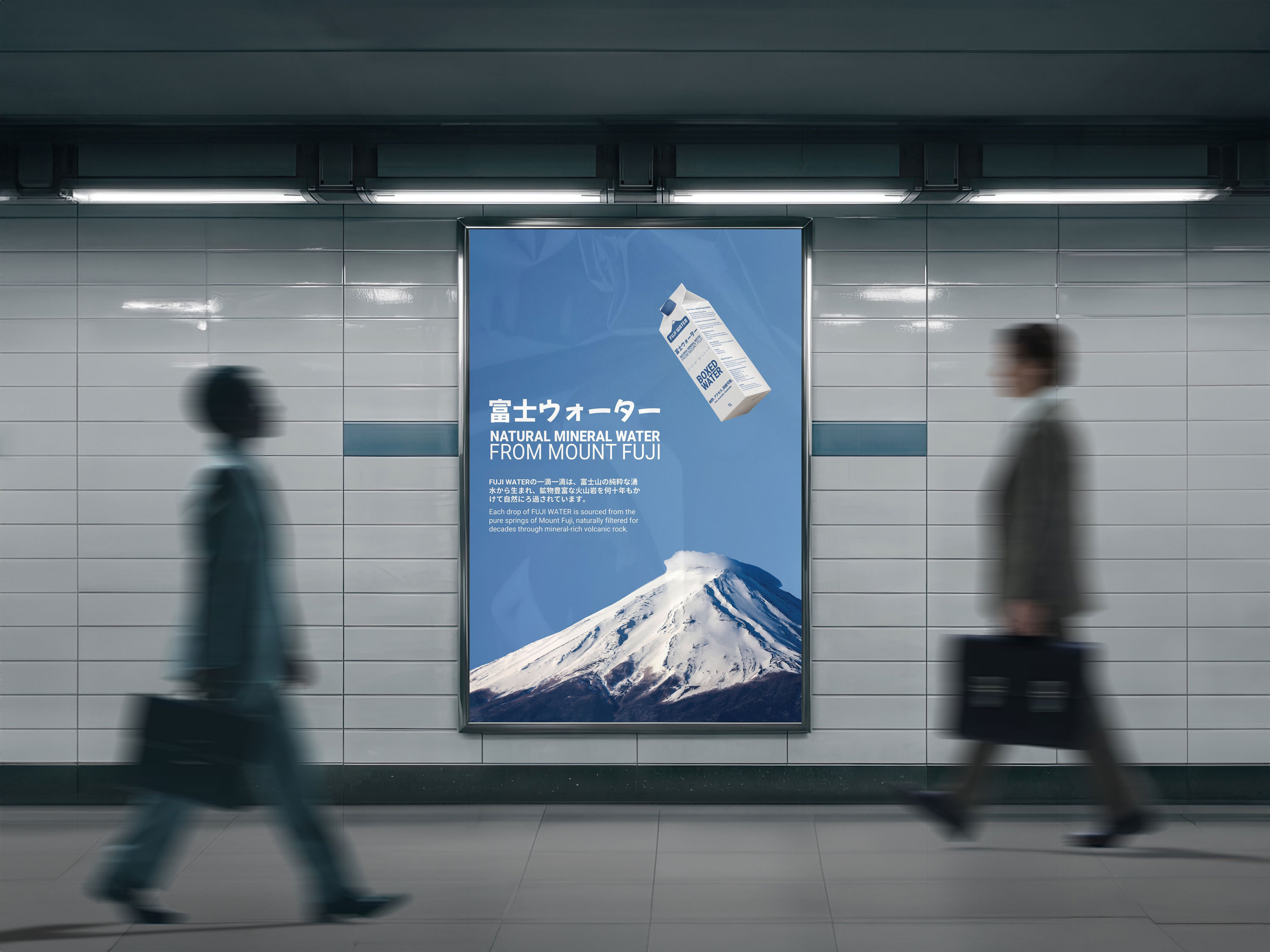
Fuji Water draws inspiration from the pristine springs and serene landscapes of Japan, offering a beverage experience rooted in purity and sustainability. Our mission was to craft a brand identity and packaging design that not only embodies these values but also champions inclusivity through thoughtful design elements like braille.
Our Approach
At Cranc Studio, we developed a comprehensive visual identity and packaging system that reflects Fuji Water’s core philosophy. We emphasized minimalism, clarity, and sustainability, ensuring every design element—colors, typography, and materials—communicates a sense of refreshment and harmony with nature.
Results
The result is a striking, inclusive identity paired with an innovative packaging design that elevates Fuji Water’s brand. This cohesive approach ensures a lasting impression, aligning the product with its vision of purity, accessibility, and environmental responsibility.

Inclusion starts with every detail,
making products truly accessible for all
Inclusion starts with every detail,
making products truly accessible for all
Inclusion starts with every detail,
making products truly accessible for all
An empty cart tells a story: without being able to see or feel what’s being bought, each product remains out of reach. Inclusive design, like braille on packaging, fills that cart with possibilities—because designing for everyone means making every experience meaningful.
An empty cart tells a story: without being able to see or feel what’s being bought, each product remains out of reach. Inclusive design, like braille on packaging, fills that cart with possibilities—because designing for everyone means making every experience meaningful.
An empty cart tells a story: without being able to see or feel what’s being bought, each product remains out of reach. Inclusive design, like braille on packaging, fills that cart with possibilities—because designing for everyone means making every experience meaningful.


